Quoctrung Bui

Quoctrung Bui

I’m a graphics editor at the New York Times where I report on economics, social policy and urban studies with charts, maps and interactive graphics.
Before that I made graphics and radio at Planet Money. And a long, long time ago I worked at the Federal Reserve as a research assistant in International Finance.
I’m currently teaching a data visualization course at the University of Chicago’s Harris School of Public Policy.
I’m a Wisconsin native living in Brooklyn where I motorcycle, sail and paint in my free time.
quoctrungbui at gmail.com | NYT bio page | @qdbui

Select work

Almost all the graphics we produce at the Upshot are highly collaborative bespoke products. Many hands are involved in the data analysis, code, design, reporting and editing. I've tried my best to outline my contribution below.
Quoctrung Bui

Everything in the House Democrats’ Budget Bill

We created a visualization, table hybrid to tackle the Build Back Better plan line-by-line.
2021-11-18 | design, code
| With Alicia Parlapiano
Quoctrung Bui

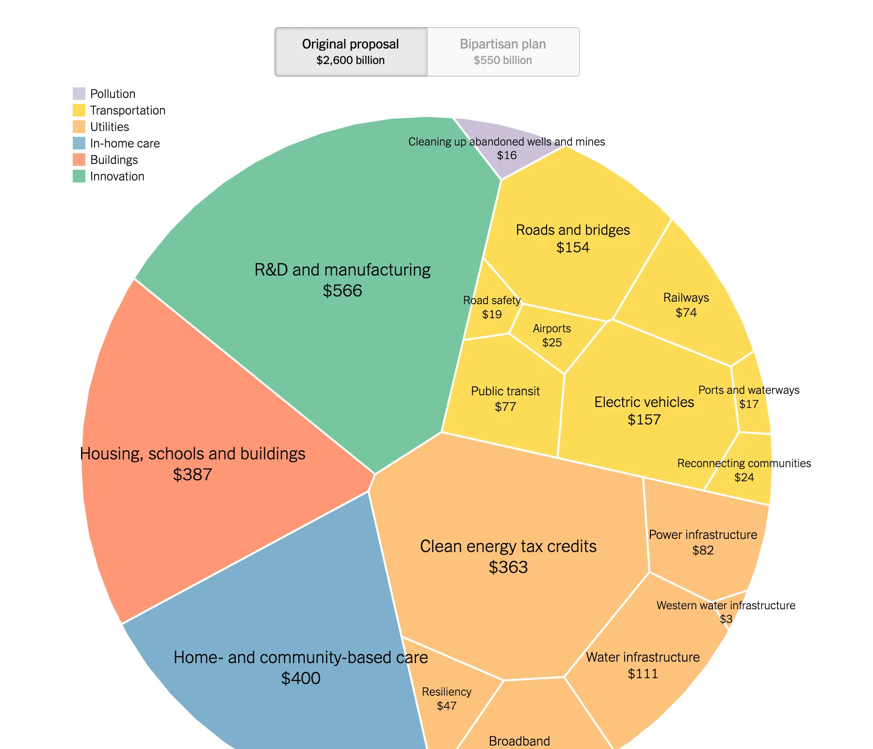
The Infrastructure Plan: What’s In and What’s Out

We designed a circular treemap to see how the Infrastructure bill changed
2021-08-10 | design, code
| With Aatish Bhatia
Quoctrung Bui

Why American Women Everywhere Are Delaying Motherhood

We were one of the first newsrooms to look at the decline of birth rates at the county level and find a curious pattern between birth and economic growth.
2021-06-15 | design, data analysis, code
| With Claire Cain Miller, Robert Gebeloff, Sabrina Tavernise
Quoctrung Bui

Small Businesses Have Surged in Black Communities. Was It the Stimulus?
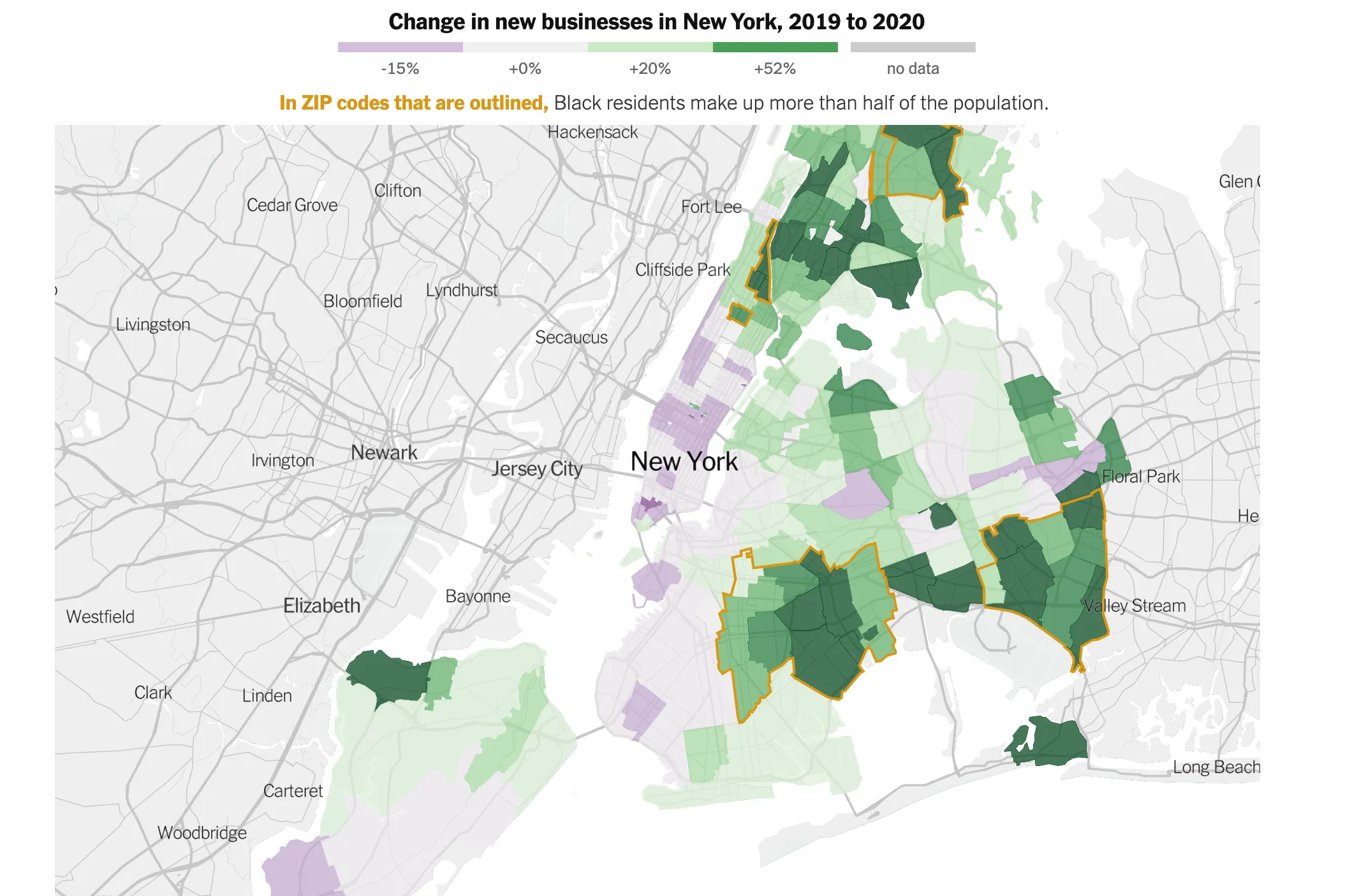
Using detailed new business filing records, I documented the rise in black small business since the start of the pandemic.
2021-05-24 | code, data analysis, design, reporting, writing
| With
Quoctrung Bui

The Postal Service Survived the Election. But It Was Crushed by Holiday Packages.
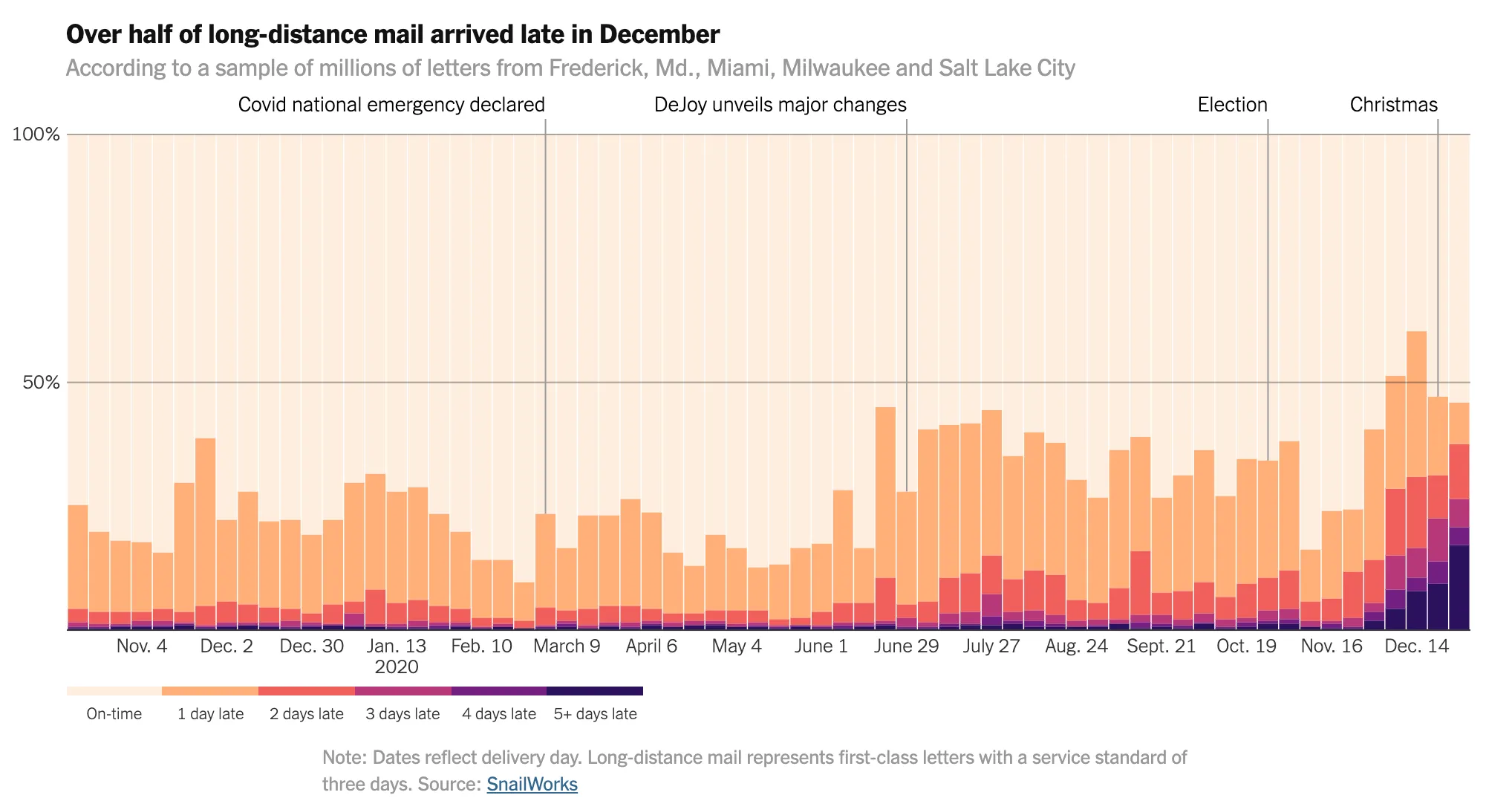
We looked into how the pandemic and election crushed the U.S. postal system
2020-09-24 | data analysis, reporting, design, code
| With Emily Badger, Margot Sanger-Katz
Quoctrung Bui

Black Lives Matter Might Be The Largest Movement in History
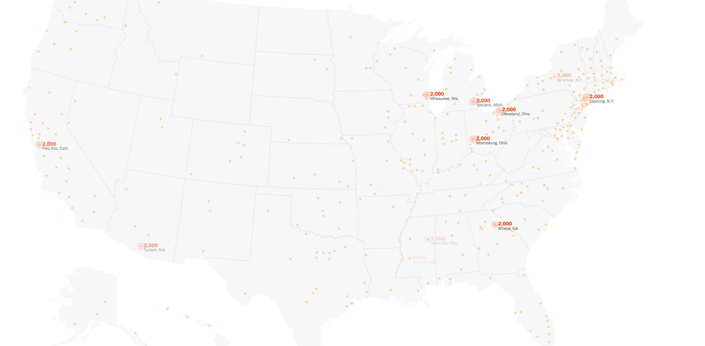
Polling shows suggest that Black Lives Matters might be the largest movement in American history
2020-07-03 | data analysis, reporting, code
| With Larry Buchanan, Jugal K. Patel
Quoctrung Bui

More Than 3 Million Americans Lost Their Jobs Last Week. See Your State.

We're one of the first to see how unemployment exploded within the first week of lockdown.
2020-03-23 | data analysis, design, code
| With Justin Wolfers
Quoctrung Bui

Cities Start to Question an American Ideal: A House With a Yard on Every Lot
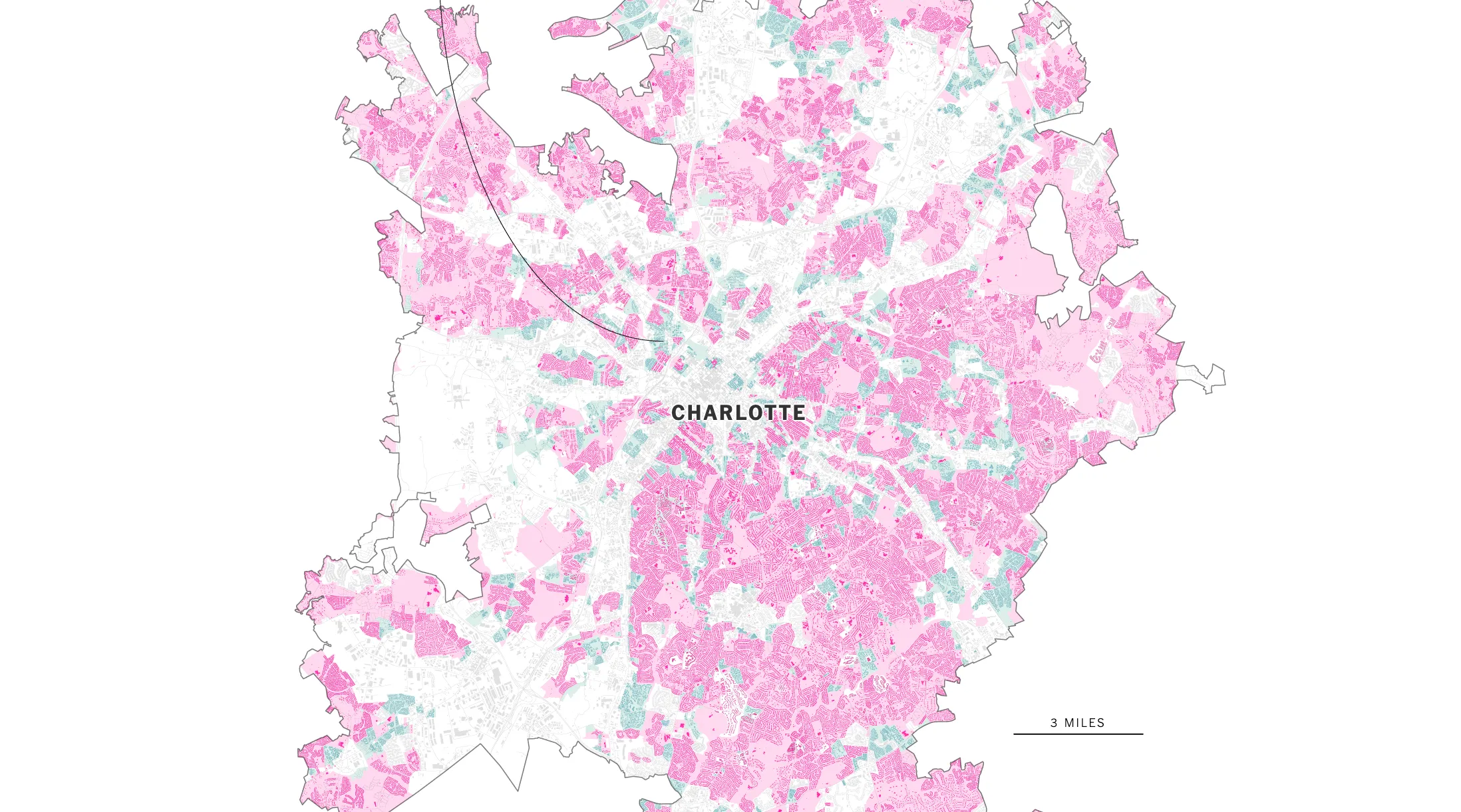
Made a comprehensive visualization on single family zoning for ten major cities in America.
2019-06-18 | data analysis, design, code, reporting
| With Emily Badger
Quoctrung Bui

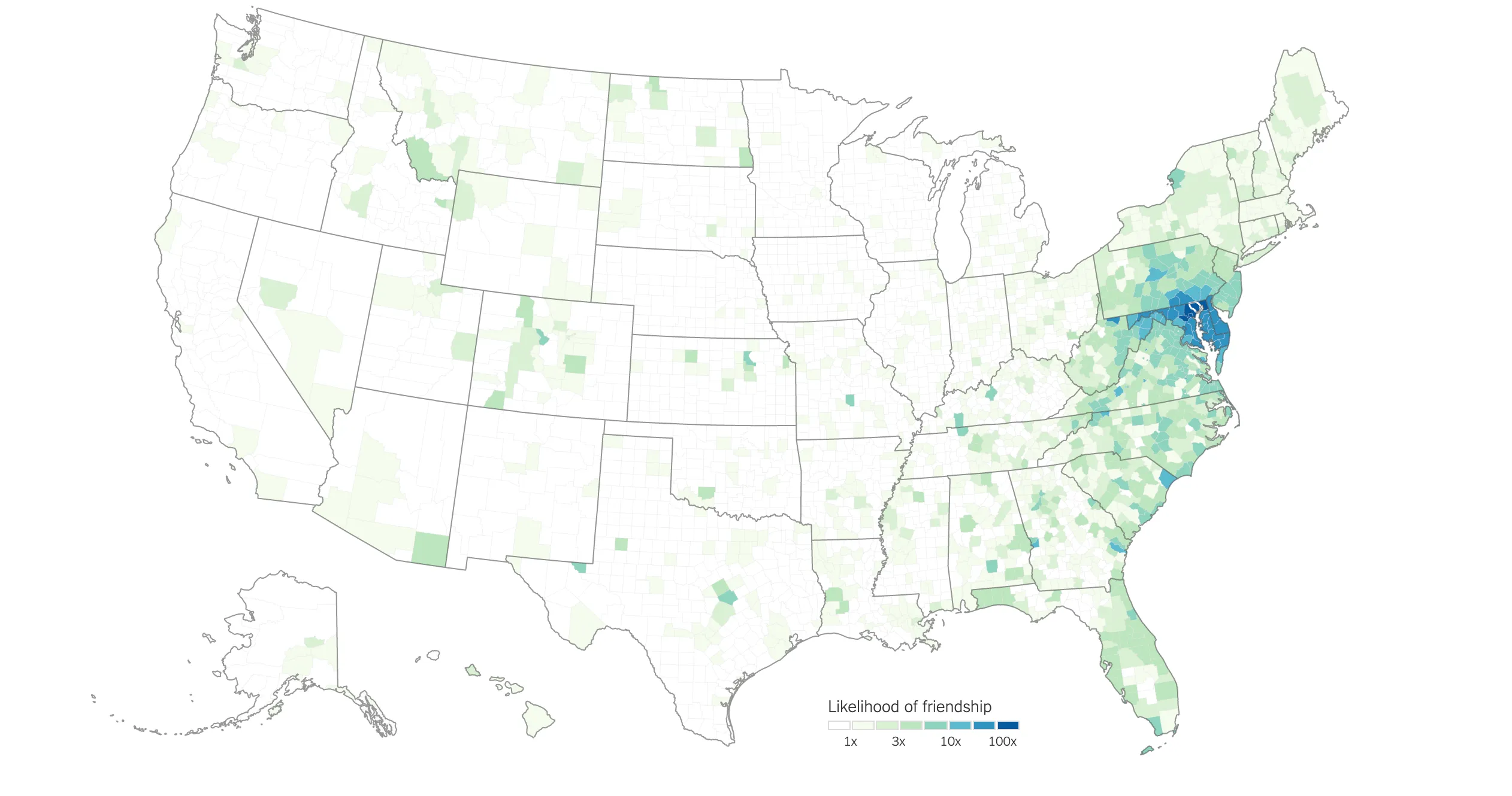
How Connected Is Your Community to Everywhere Else in America?

I made a pretty neat map of count-level social connections. Turns out that, in most places, friendships are pretty isolated to just a handful of counties.
2018-09-19 | reporting, design, code
| With Emily Badger
Quoctrung Bui

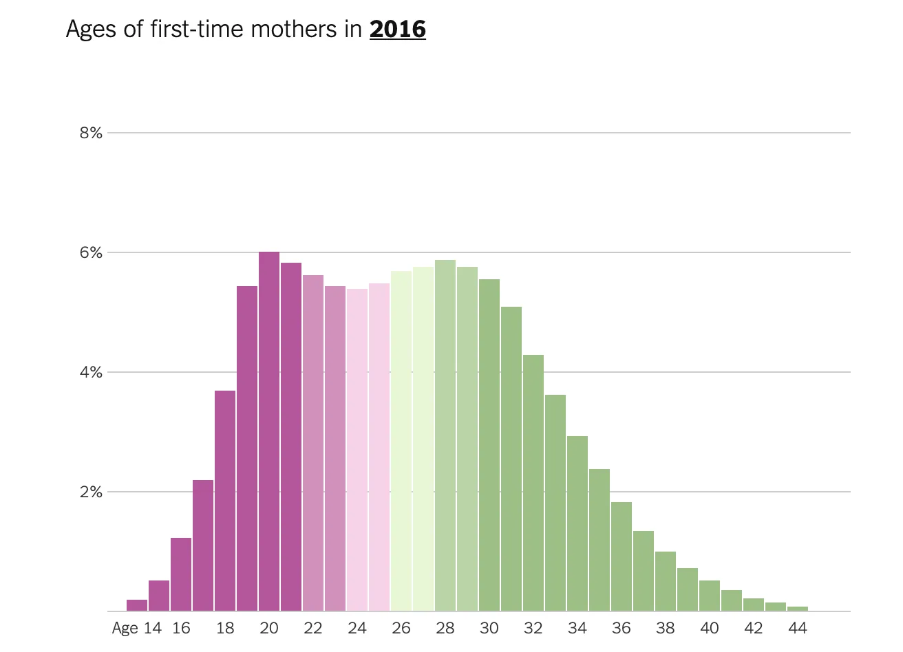
The Age That Women Have Babies: How a Gap Divides America

I reported and produced several maps exploring the divergence of first-time motherhood in America
2018-08-04 | reporting, design, code
| With Claire Cain Miller
Quoctrung Bui

In 83 Million Eviction Records, a Sweeping and Intimate New Look at Housing in America
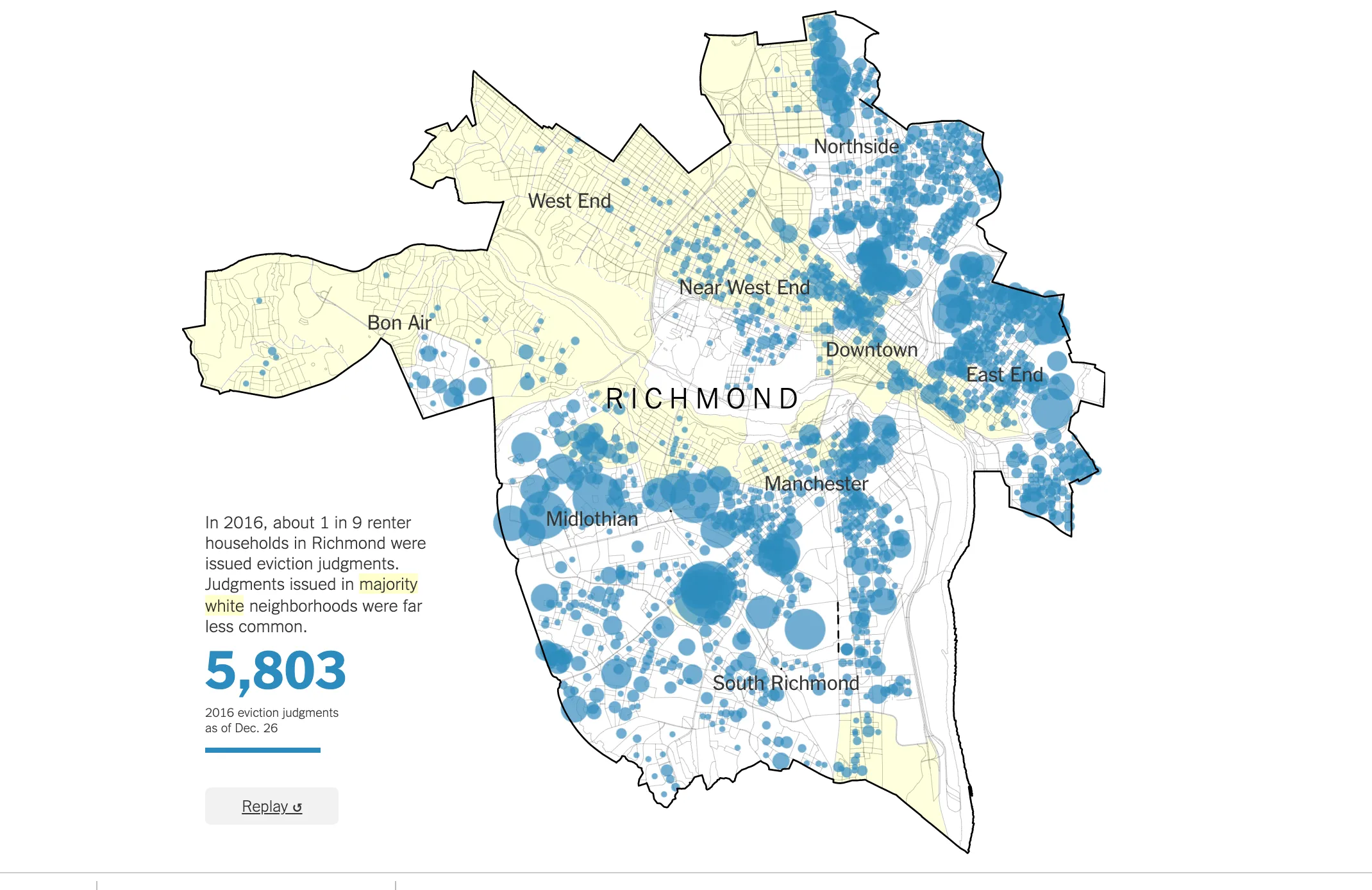
We looked into the very first database of evictions in America
2018-04-07 | data analysis, reporting, design, code
| With Emily Badger
Quoctrung Bui

Tax Bill Calculator: Will Your Taxes Go Up or Down?
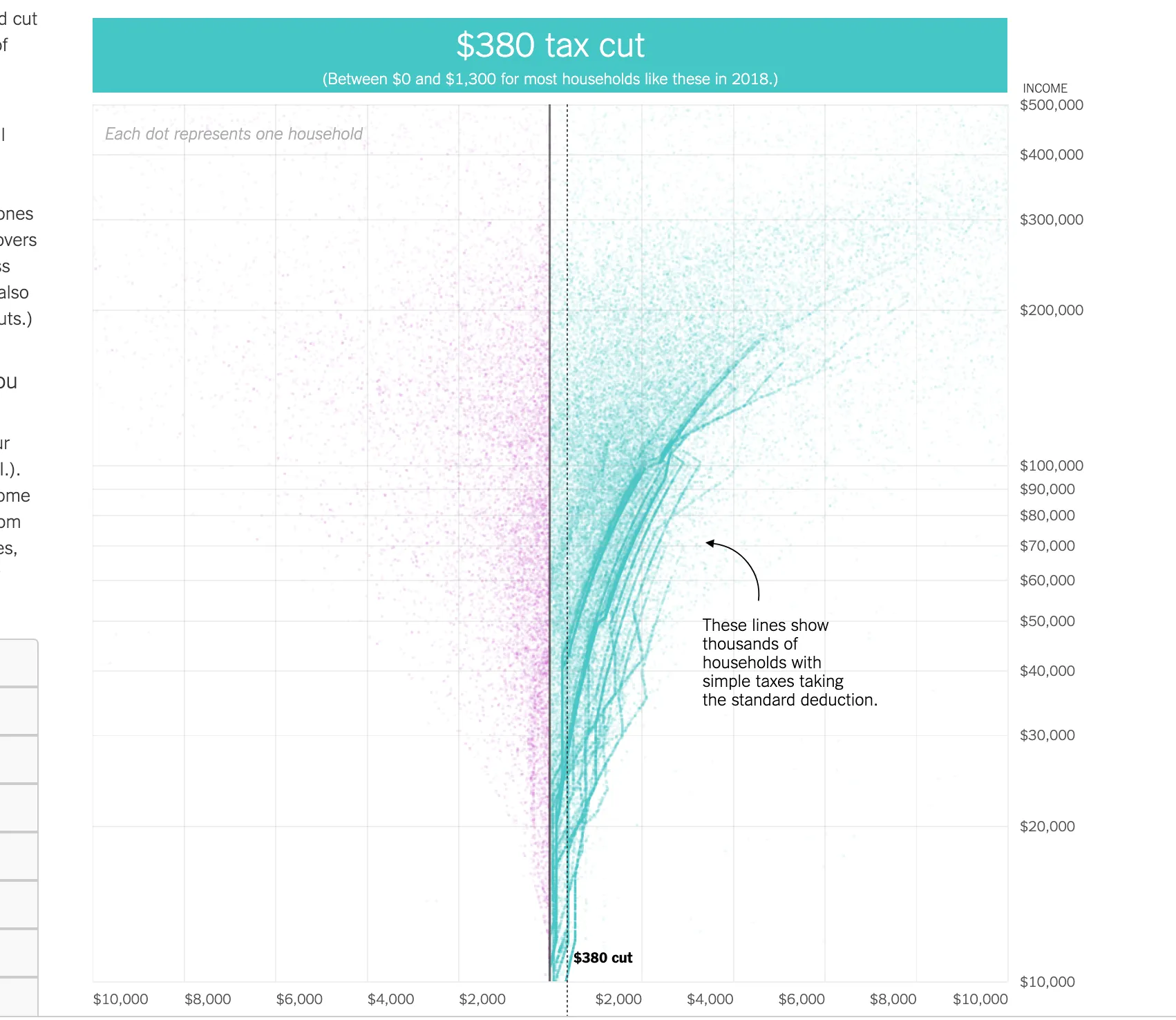
Expanding on the previous piece, we built a calculator that displays how the 2017 tax law would affect more than 200,000 households of all incomes.
2017-12-17 | data analysis, reporting, design, code
| With Ben Casselman, Adam Pearce, Blacki Migliozzi
Quoctrung Bui

What the Tax Bill Would Look Like for 25,000 Middle-Class Families
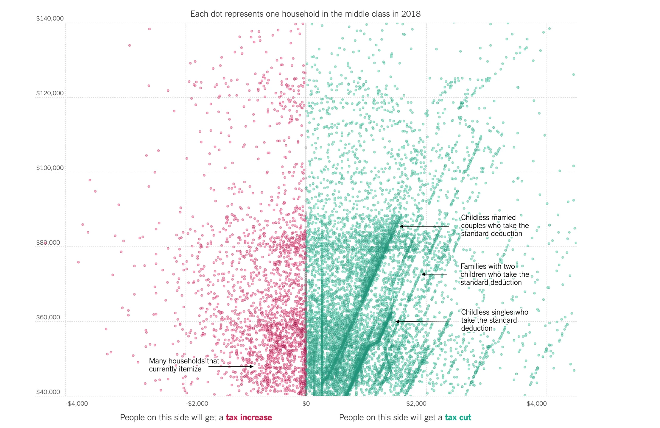
Tax policy is hard to explain and even harder to show. Tax charts tend to get pretty boring when you compress the complexity into averages. So for this graphic I decided just to show what the proposed taxes would do to 25,000 middle class families. It's really satisfying to see where most people tend to cluster, as well as the really odd edge cases.
2017-11-28 | data analysis, reporting, design, code
| With Ben Casselman
Quoctrung Bui

Mapping the Shadows of New York City: Every Building, Every Block

Buildings in the city are in a constant battle for light and air. We designed a gorgeous map of all the shadows cast by New York's buildings to see who's winning.
2016-12-21 | design, code, reporting, writing
| With Jeremy White
Quoctrung Bui

40 Percent of the Buildings in Manhattan Could Not Be Built Today

Because of how zoning has changed in the city over the last 100 years, much of what exists in New York would not be allowed to be built. But these very same regulatory artifacts are the reason why the city is so rich and complex.
2016-05-20 | design, reporting, writing
| With Matt Chaban, Jeremy White
Quoctrung Bui

The Typical American Lives Only 18 Miles From Mom
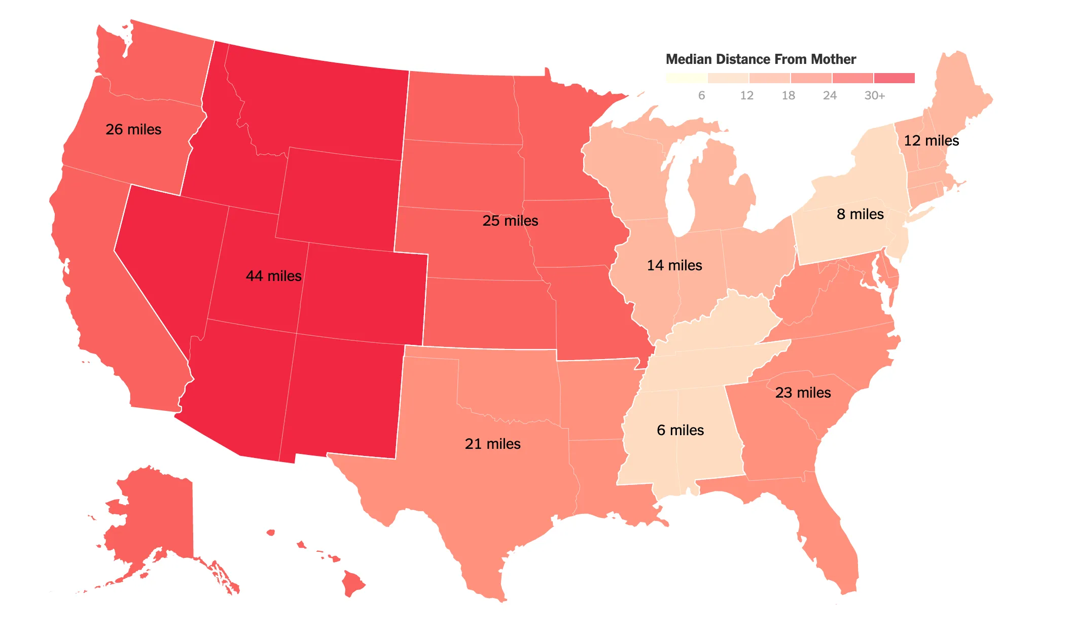
We looked at the typical distance an adult person lives away from their mother, and what that means for the world at large.
2015-12-23 | data analysis, design, code, reporting
| With Claire Cain Miller
Quoctrung Bui

What Happens When the Fed Raises Rates, in One Rube Goldberg Machine

We designed a rube goldberg machine to help explain how a rate change filters throughout the rest of the economy.
2015-12-16 | design, reporting
| With Amanda Cox, Alexandra Garcia